I thought it would be fun to share some photos of three stages of prototyping the mental stress cards I’ve gone through. The pictures of course only tell half the story – you really need to feel the cards in your hands to get a sense of what it’s like to use them. But I’ll do my best to describe the tactile side here for you after the photos.
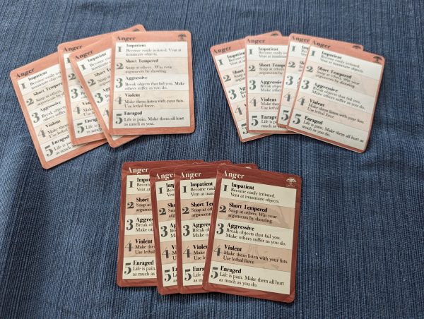
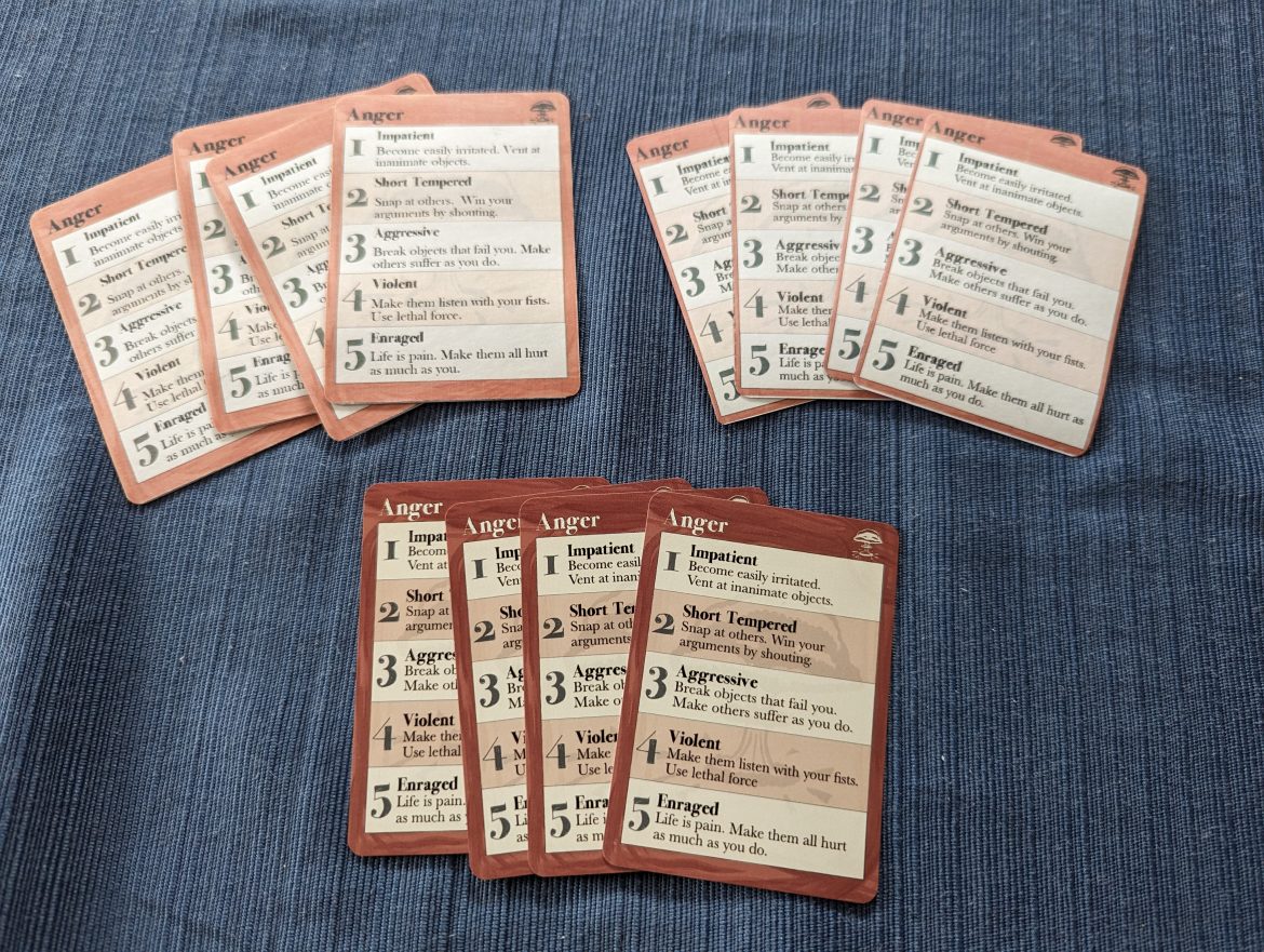
The first set on the left were created for the sake of shooting the Kickstarter video. It’s a weird fact that you need to shoot video of the thing you want to create before it gets created, so I did my best. Since I have time I may reshoot some footage with the most recent set, but there will definitely be some shots of this first set in the video. But I digress…
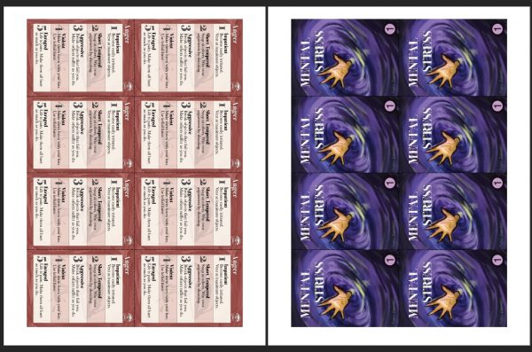
This set was made using my home inkjet printer and standard 110 lb cardstock that you can get down at your favorite office supply store. I set out the artwork to have the back of the card upside-down below the front, like this:
I then cut each card out, folded along the bottom edge, glued them, and trimmed the corners. The result has a really nice heft to it as the cards are two layers of cardstock. However, the glue kind of made them a little warped and wavy. The colors are a little light due to how matte standard cardstock is. Also the cards are slightly too large, as the artwork includes some extra bleed for how the real printer will print and cut them.
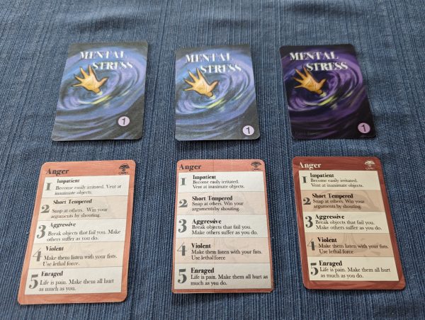
The second prototype is closer to how the digital print and play cards will look. The final PDF is laid out with one page of fronts for each card type and one page of backs, like this:
I printed this again on standard 110 lb cardstock, then flipped the page over and re-printed the backs on the other side. I then cut and trimmed the corners of the cards. These cards definitely feel flimsier than the first prototype, but they don’t have warping and the bleed has been pre-trimmed from the artwork so the size is more accurate. All in all these are fine to play with, but they still suffer from a matte appearance and a flimsy feel.
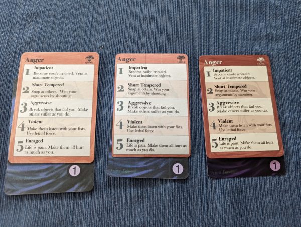
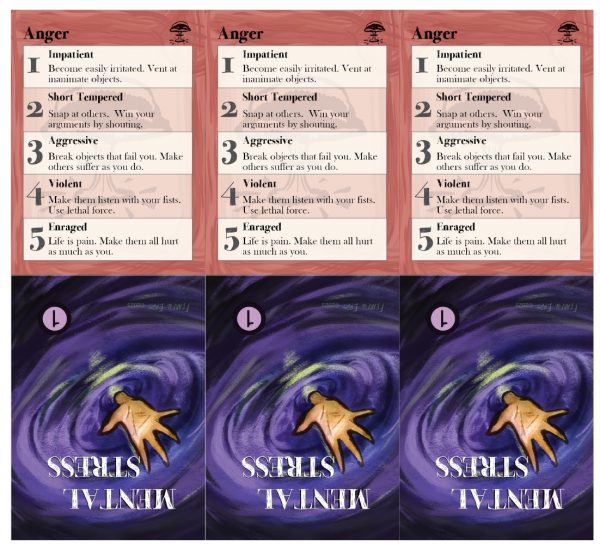
Finally, the right-most pictures are a set of cards I had professionally printed. These should be pretty close to how the real cards will look for those that buy the physical product. The colors are nice and dark, and the cards have that glossy look of real playing cards. This also makes them feel snappy in your hand and makes the cards easier to fan on the table. This also makes them feel better when playing Descents as shown in the last picture. This third prototype is what I’ll be bringing with me to play with at conventions.
You’ll probably also notice some art changes across the three prototypes. We adjusted the size of the text boxes and changed the title and icon at the top from black to white based on how the early prototypes looked. Making these prototypes was really helpful to our process, both to have physical cards for playtests and video shoots, and for feedback on what the final product was going to look like.
So there you have it. The second protoype I think is fine, and it’s close to what you’ll get if you opt for the digital print and play option when backing the Kickstarter. On the plus side that tier will be much cheaper, won’t require any shipping, and you can print as many cards as you want. That said, I can’t deny how much better the professionally made cards look and feel to me, so I hope you’ll consider pledging at the physical copy tier to get these gorgeous cards.
One final side note, for those taking the DIY route — I hand trimmed the corners of each individual card using a corner punch tool which you can get on Amazon for $8. It’s a little thing, but I think really helps make homemade cards look a little better, so I thought I’d share.