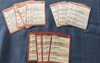
The star of the show in Fearful Ends is clearly the Mental Stress Cards. This deck of cards is the key mechanic for dictating the mental or emotional break down of their characters. As they are a deck of cards there’s some randomness in how they get distributed, but through play the players do have the ability to control to some degree the pacing and the direction of their break downs.
One of the most important mechanics of these cards is called the “Tell”. The first time a player puts a specific kind of card into play they must play it face up in front of them. At this point they’re not affected by the card yet, but they are broadcasting to the table the direction they think their character is going. The name is a play on the concept of tells in poker, and the point is to allow other players time to process what direction the other characters are going, raise objections if they must, or play into it if they are so inclined.
I had one excellent example of the latter when two players sitting across from each other began with the Obsession and Paranoia cards respectively. Both cards require incorporating another player at the table – in one case a character your character becomes fixated on, and in the other a character your character believes is out to get them. Naturally these players selected each other as their targets, and set themselves up for a glorious head-on collision down the road in the game, much to their and everyone else at the table’s delight.
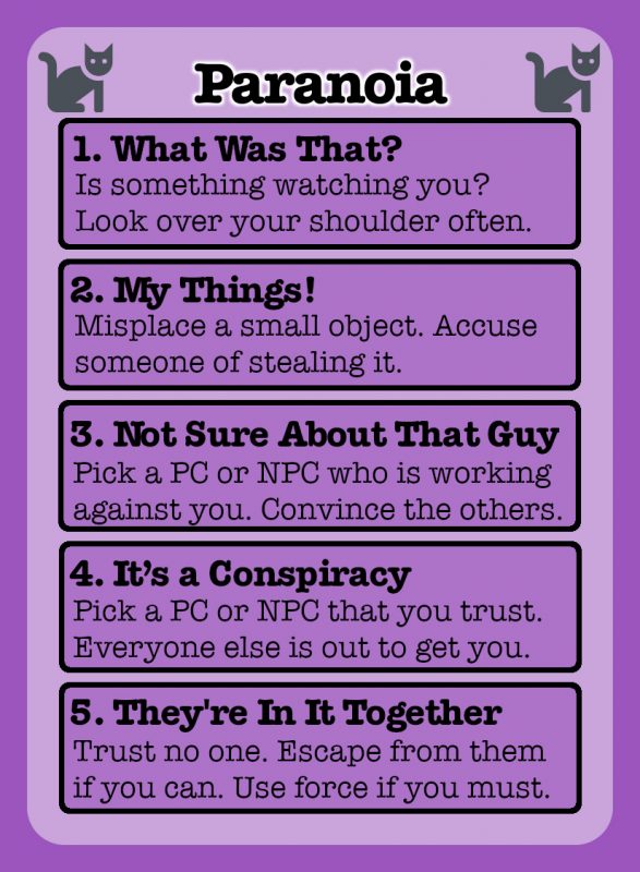
These cards have a lot of text on them. Even after extensive editing there’s just not really room on the card for anything else. However, for Tells to work, the cards must be visually distinct and easily identifiable from across the table. Initially I did this by coloring the cards very different colors, and then for accessibility reasons I started adding a unique icon to the top corners of the cards. While I worry that this maybe makes them look a little play-school or web 2.0, it accomplishes the goal quite handily. I picked the icons with extreme care to try and communicate the nature of the card, and now I can very quickly identify them at a glance. Here’s my logic for each:
 | Anger – I went with a bomb, because your character is about to explode! |
 | Anxiety – Representing dread of future events, I wanted something that was evocative of fear, and what’s scarier than a ghost? |
 | Hallucinations – Your character sees things others do not, thus this one gets an eyeball. |
 | Obsession – Your character becomes fixated on someone else, someone that becomes something like a shining star to you. |
 | Memory Loss – Likely the hardest one to represent, I chose the three wavy lines because they’re visually distinct, and perhaps could represent that your character is lost at sea? |
 | Paranoia – Fear of imagined threats reminds me of superstitions, and the classic superstition is of course that pertaining to black cats. |
These choices all predate the inclusion of my wonderful Art Director on the project, and I was worried when I showed them to her she’d say they had to go. But she made the lovely comment that they kind of reminded her of Zener cards, those cards they use to test for ESP. This delighted me to no end, as not only does that have a little veneer of the spooky and paranormal to them, but I’ve even used Zener cards as a prop in one of my horror games in the past. Perfect!
I was going to say, I got a very opening to Ghostbusters vibe from them.